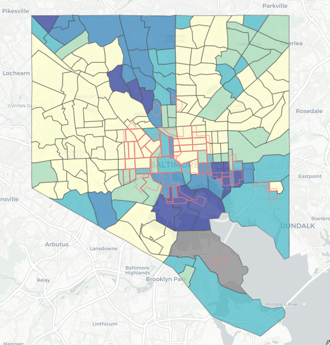
This interactive graphic displays the changes in per capita income in Baltimore census tracts from 2010 through 2020, while offering context on the neighborhoods’ racial and ethnic makeup. The tracts bordered by red lines show neighborhoods that had been redlined, where banks or insurance companies avoided doing business due to the resident’s race or ethnicity. The “Data Explorer” tab allows you to see the underlying data represented on the map. This graphic was created by Shreya Vuttaluru who used the Shiny package in R.
Baltimore Divided: Explore income and demographics

